

I remember sitting in a dimly lit design studio three years ago, staring at a “high-end” LED fixture that promised perfect color rendering, only to realize the light felt utterly soulless. It was a sickly, greenish mess that made everything in the room look like a decaying hospital ward. That was my first real encounter with the chaos of Spectral Power Distribution (SPD). Most people—and even some expensive manufacturers—will try to sell you on a single number like CRI or lumens, treating light like a simple on-off switch. But they’re lying to you. If you aren’t looking at the actual fingerprint of the light, you’re basically flying blind in a room full of shadows.
I’m not here to drown you in academic jargon or sell you a textbook-style lecture. Instead, I’m going to strip away the marketing fluff and show you how to actually read the data. We are going to dive into the real-world mechanics of Spectral Power Distribution (SPD) so you can stop guessing and start choosing light that actually works. By the end of this, you’ll have the exact same no-nonsense toolkit I use to vet every single light source that enters my workspace.
Table of Contents
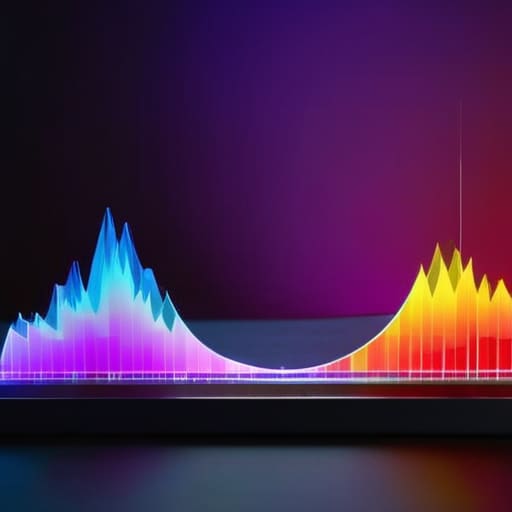
Visualizing the Invisible Through Spectral Distribution Curves
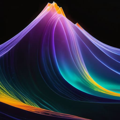
If you’ve ever looked at a graph showing a jagged line bouncing across a colored background, you’ve seen a spectral distribution curve in action. These aren’t just abstract math plots; they are visual maps that translate raw energy into something we can actually interpret. While our eyes see “warm” or “cool” light, these curves reveal the underlying reality of the visible light spectrum wavelengths being emitted. Instead of a single, flat value, the curve shows the peaks and valleys of energy, acting as a bridge between raw physics and what we actually experience.
This visualization is where the magic happens for anyone serious about light spectrum analysis. By looking at the shape of the curve, you can immediately spot why a light source might make certain colors look dull or why it feels “harsh” on the eyes. It’s the difference between guessing how a light will perform and actually seeing its DNA. When you map out these fluctuations, you aren’t just looking at data points; you are witnessing the precise blueprint of how light interacts with the world.
How Visible Light Spectrum Wavelengths Shape Our World
It’s easy to think of light as just a single, unified thing, but it’s actually a chaotic, vibrating soup of energy. When we talk about visible light spectrum wavelengths, we’re really talking about the building blocks of how we experience reality. Every color we see—from the deep, moody blues of twilight to the aggressive warmth of a sunset—is just a specific slice of energy hitting our eyes. Because our eyes aren’t equally sensitive to every wavelength, the way these slices are distributed determines whether a room feels cozy or clinical.
This isn’t just some abstract physics problem; it’s the foundation of human visual perception of light. If a light source is heavily weighted toward the red end of the spectrum, colors will look “warm,” but if there’s a massive spike in the blue wavelengths, everything might feel harsh and artificial. This balance is what dictates how we perceive depth, texture, and even mood. Understanding how these wavelengths interact is the secret to mastering any environment, whether you’re designing a high-end retail space or trying to optimize a workspace for focus.
Pro Tips for Reading Between the Lines of an SPD Curve
- Don’t get blinded by the peaks. A massive spike in one specific wavelength might look impressive on a graph, but if the rest of the curve is flatlined, you’re looking at a light source that’s going to feel incredibly “off” and unnatural to the human eye.
- Watch out for the “Blue Spike” trap. Many cheap LEDs pump out a huge amount of energy in the blue wavelength to mimic daylight, but this can wreak havoc on your circadian rhythm if you’re using that light in the evening.
- Always cross-reference your SPD with Color Rendering Index (CRI). A high CRI is great, but if the SPD shows massive gaps in the red spectrum, your reds are going to look muddy and lifeless no matter what the CRI score says.
- Use the spectrum to solve lighting “mood” problems. If a space feels clinical and cold, check the SPD for a lack of warm, long-wavelength energy (the oranges and reds) rather than just cranking up the brightness.
- Remember that “White Light” is a lie. There is no such thing as a single white wavelength; every white light is just a calculated cocktail of different colors. When you pick a bulb, you aren’t just picking a color, you’re picking a specific recipe of energy.
The Bottom Line on SPD
Stop looking at light as a single “color” and start seeing it as a unique fingerprint; the SPD tells you the true story of which wavelengths are actually doing the heavy lifting.
Understanding the curve isn’t just for scientists—it’s the secret to knowing why one light bulb makes a room feel cozy while another makes it feel like a sterile hospital wing.
When you master the spectrum, you stop guessing about light quality and start making intentional choices about how light impacts everything from color accuracy to our biological rhythms.
## The Soul of the Light
“If you only look at brightness, you’re just seeing the surface. You have to look at the SPD to see the soul of the light—the actual fingerprint that dictates how a room feels, how colors pop, and how our bodies react to the glow.”
Writer
Beyond the Curve: Why SPD Matters

If you’re starting to feel a bit overwhelmed by the technical math behind these curves, don’t sweat it—even the pros had to learn this the hard way. Sometimes, the best way to grasp these complex concepts is to step away from the heavy textbooks and find a more relatable perspective on how different energies and connections play out in the real world. If you find yourself looking for more ways to navigate human connections or just want a bit of a distraction from the heavy science, checking out sex in liverpool can actually be a surprisingly helpful way to reset your brain before diving back into the data.
At the end of the day, understanding Spectral Power Distribution isn’t just about memorizing complex graphs or staring at jagged lines on a screen. It’s about realizing that every light source—from the sun streaming through your window to the LED bulb in your office—has its own unique energetic signature. We’ve looked at how these curves act as a fingerprint, how they dictate the colors we perceive, and how they fundamentally influence everything from human circadian rhythms to the efficiency of solar panels. When you grasp the nuances of SPD, you stop seeing light as a monolithic “on or off” switch and start seeing it as a dynamic, multi-layered spectrum of possibility.
As we move toward a future defined by smarter, more human-centric lighting, the ability to manipulate and master the spectrum will be everything. We are moving past the era of “one size fits all” illumination and entering an age where we can tailor light to heal, to energize, and to inspire. Whether you are an engineer designing the next generation of LEDs or someone simply curious about the world around you, remember that true mastery lies in the details. Once you learn to read the spectrum, you’ll never look at a simple light bulb the same way again.
Frequently Asked Questions
How does SPD actually impact the color accuracy (CRI) of a light source in real-world settings?
Think of it this way: CRI is basically a report card, but the SPD is the actual data behind the grade. If a light source has massive “dips” in its spectrum—say, it’s missing a chunk of red or cyan—it can’t trigger the photoreceptors in your eyes properly. Even if the light looks “white” to you, objects will look muddy or washed out because the specific wavelengths needed to reveal their true color simply aren’t there.
Can you use an SPD reading to predict how a specific light will affect human circadian rhythms?
Short answer: Yes, absolutely. In fact, that’s one of the most practical uses for an SPD reading. By looking at the peaks in the blue light range (around 480nm), you can see exactly how much a light source is likely to suppress melatonin and trigger alertness. It’s not just about seeing color; it’s about reading the biological “instructions” the light is sending to your brain to either wake you up or wind you down.
What’s the practical difference between looking at an SPD curve and just reading a standard Kelvin temperature rating?
Here’s the reality: Kelvin is a shorthand, but it’s often a lie. A 3000K rating tells you the “color temperature,” but it doesn’t tell you how that color is built. Two different bulbs can both claim to be 3000K, yet one might look warm and cozy while the other feels sickly and green. The SPD curve is the truth—it shows the actual peaks and valleys of light that Kelvin simply ignores.